Forum Replies Created
-
AuthorPosts
-
Lucas
ParticipantJuly 6, 2010 at 10:17 pmPost count: 34in reply to: [Bug] Mouse position in Chrome #3866Hi Eric,
Actually I just realized I’m using 6.0.453.1 dev , which is not the main Chrome version… this may be one reason. I’m on Windows 7 Ultimate 32-bit.
ParticipantJuly 6, 2010 at 2:26 amPost count: 34in reply to: [Bug] Mouse position in Chrome #3863Hi Eric,
It happens on all the rows for me, not just the last one. Prnt Screen doesn’t work, it doesn’t grab the mouse. I just installed a trial for SnagIT, tried to capture an area… and for some odd reason, in the screenshot the mouse is fine.
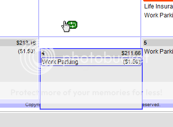
Actually, it’s not that the icons and selections are at the wrong place – it’s that the mouse itself moves up and left. I can see it “jump” when I hover over the calendar. I’ve noticed it is correctly placed on non-repeating entries, and “between” dates (in the 1-2 px between), so it’s definitely the custom mouse pointers that are causing this.
What it looks like (and this may be completely off track) is as if your mouse pointer was a transparent gif or png that had a padding of 25px right and bottom, and your javascript to replace the pointer icon was putting it at the wrong place. That doesn’t explain why it looks fine in SnagIT when I take the screenshot though!
Anyway, I can’t give you a real screenshot but this is a mockup (not my data, this is the “Demo” data!):
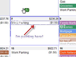
As for the bottom row, I’ve noticed that before, the actual day goes “down” some 10-15px, and in my case the cursor is still higher:
 ParticipantJuly 5, 2010 at 10:26 pmPost count: 34in reply to: iPhone App? #3780
If I may, I would personally really like the app to look like the default Calendar App. Why? Because it’s clean, easy to use, and intuitive. Keeping the same type of interface would let people concentrate on the budget and not the interface.
By the way, my strong personal suggestion: keep this free. We already have to pay for the service and, even though I realize that there are costs involved in developing and maintaining the app in the app store, I wouldn’t like to pay a lot for a new interface to a service I’m paying. Then again, paying $0.99 wouldn’t be a big deal, so if you feel you have to, keep it at that :)
Also, when you thought of this originally the iPad was just a dream – now it’s a reality that you may want to deal with. The iPad offers much more screen real estate, so it’s a definite plus. If you charge for the app, make it “universal” (for both) and you’ll make everyone happy!
ParticipantNovember 16, 2009 at 3:11 pmPost count: 34in reply to: "Repeat" entries – icon and separation #3824Awesome! That’s exactly how I imagined it would behave! Nice work man!
Now you only need a little icon like the + for new entries and you’ll be set (I was imagining 1 or 2 arrows in a circle, think something like these images). But that’s no rush :)
Thanks again!
:LucasParticipantNovember 13, 2009 at 9:25 pmPost count: 34Eric,
Is there any update on a timeline for this feature? I’m really looking forward to having interest rates available in the calendar (though the features you have added since I started are pretty awesome by themselves!).
Cheers,
:LucasParticipantFebruary 27, 2009 at 9:12 amPost count: 34in reply to: Nitpick about entering dollar amounts #3736Let me put in my own little nitpick. When I click on the Amount box, it would be nice if the amount selected itself in order to re-enter it. Entering amounts that are just 4-5 numbers is a lot faster when just re-typing it, rather than trying to correct the amount manually. Clicking takes way too much time, so does using left and right arrows – I’d much rather simply tab to the box, re-enter the amount, hit enter and be done with it.
ParticipantFebruary 13, 2009 at 2:25 amPost count: 34in reply to: [FEATURE REQUEST] Print Calendar #3718Awesome. And because I don’t want to do a separate topic for this… How about:
“Collapsing the Categories”. If one has a lot of items in some days, collapsing the categories on the left (“hide” them) would give more breathing room to the items that show up. What do you think?
ParticipantFebruary 10, 2009 at 6:15 pmPost count: 34in reply to: Future Feature List #3563Along with the session refresh, maybe you could think about adding a checkmark to the Accounts Setup screen, “Visible on All Accounts”. Some might think it defeats the purpose, but I would actually call it “Overview” and give the option to ignore some accounts. I actually have a Visa and my Car Loan account in there, and seeing a negative number in the 5 digits in my “all accounts” isn’t very enticing to my budget (Plus, it shows transfers as 2 entries which can be confusing).
ParticipantFebruary 10, 2009 at 6:10 pmPost count: 34in reply to: [FEATURE REQUEST] Print Calendar #3716The printing is more for an overview of the current month instead of having to go on the PC, even if it’s printed on the 1st and not updated during the month. It could be used to jot down expenses quickly before doing an update on the PC, and to remind yourself that “oh sh*t, I have a chiro appointment, I need to take out money to pay him today”.
I see it as looking a lot like a normal looks like – black boxes with the date and entries in them. The entries don’t need to be highlighted but at least underlined to easier identification. Right now it’s obvious that it’s a calendar but hard to see because there are no separating lines between the dates, and the entries are just text without formatting, meaning it’s just a bunch of floating numbers and text.
Personally, I don’t mind if empty columns are narrower, but for me that’s not generally sunday (feb and march, that`s the 1st and the 15th, dates full of payments) or saturday (groceries, weekly gas, etc). It would probably be easier just to have it nice and equal all around. Right now though the most wasted space is with the categories on the left, as well as the big margins (not forgetting the menu on the top-right). Also if I print background colors and pictures, the calendarbudget logo repeats itself all over the place.
ParticipantFebruary 7, 2009 at 6:56 pmPost count: 34in reply to: Future Feature List #3561I think Google Gears handles the update from offline to server also…
I had another flash (when you get tired of them, just tell me :P) in regards to the “Stay logged on” feature.
What I’ve noticed is that if I put my computer to sleep and then come back to it later with my browser still open, I can still view what’s on my calendar for the current month, try to add or edit items, but if I try to actually make a change it gives me a “Session Expired” error, I click OK, and i can still see the calendar and everything.
My suggestion would be:
If the system detects the session is expired, it shows you a box that says “Session expired, please re-enter your password: [********] [OK]”, and will have kept in memory the change you were doing. It logs you right back in, does the change you requested, and voilà! You don’t actually need to remember sessions and logons, you just have people re-enter their password (which isn’t very annoying or intrusive if you ask me).ParticipantFebruary 4, 2009 at 7:08 pmPost count: 34in reply to: [FEATURE REQUEST] Country Currency #3714Actually, I was thinking of this a lower priority, and it’s not for myself.
It’s nice to have some features for the future, so you can keep those “New Features!” comin’!
ParticipantFebruary 4, 2009 at 3:19 pmPost count: 34in reply to: Mouse Wheel #3591You’re the man, man!
I’m glad to live only 4 hours away from the guy who created CB. Makes me proud to be Canadian! (which brings me to another idea, check other post)
ParticipantFebruary 3, 2009 at 4:09 amPost count: 34in reply to: Mouse Wheel #3589I just realized that Google Calendar simply goes from month to month when using the scroll wheel – one month at a time, no page reload, no bouncy effects… and I kind of like it. It does feel more intuitive than having to click arrows, and doing fancy javascript wouldn’t help the performance and simplicity of the page at all.
The only reason I would love to use the mouse wheel is because I want to be able to have a quick snapshot of the previous and next month fast – especially when there are months like February where the 1st of the month is the 1st square you see, there is nothing left from January.
Without going into the scroll wheel however, do you think it would be desirable to always show at least one day of the previous month on the calendar? See, if the 1st of the month is any other day than Sunday, it’ll always show the last 1-6 days of the previous month, where as if it’s on the Sunday is doesn’t – so whereas you can see weeks into the future, you can’t even see one day in the past.
I guess you could call that (option?) “Calendar Centering”…
ParticipantFebruary 3, 2009 at 4:03 amPost count: 34Eric, Remember you’re catering to you’re client’s needs, not only to your own :). I think the percentage of people that always pay off their credit cards every month is probably very low. If that weren’t the case, they’d be out of business!
When all is said and done, having a different (and easily identifiable) account type for fixed-interest accounts is really the best. This can be applied for both credits (negative balance, interest is tacked on the negative) and even savings accounts (interests are added to your monthly balance). I can’t wait to see this option on my calendar!
ParticipantFebruary 2, 2009 at 7:32 pmPost count: 34I’ve just had another flash for this idea, tell me if it’s feasible or completely off-track.
Why not treat these debts as an account? I’m going to try this manually, I created a “Visa” account where I put my original debt to start with (a negative number). I then will start indicating that I’m doing “payments” by transfering money to this account, and payments or purchases made on Visa will simply be taken from the Visa account. When I am paying my Visa bill then, I simply make a transfer to the Visa account and the negative number is reduced!
Each entry could show more details related to what they entail in terms of “loss” (interest fees) over time, a nice indicator that you’re not helping yourself by having a credit card or margin…
To complete this, it would need to tack on the interest rates automatically (where here I will add them manually), and possibly the 9 account cap would have to be “fixed” (I know this required a lot of coding for you though) – unless they are actually treated as a “Credit Account” which would be different than actual bank accounts.
What do you think?
-
AuthorPosts