Get Started with CalendarBudget Reports: Demo & Free Trial
Knowing where your money goes makes budgeting simpler. Reports and charts turn raw transactions into clear visuals so you can spot trends and make smarter choices. This article shows how to use reports and charts to understand your spending, find opportunities to cut costs, and improve your budget. We’ll cover which expense categories to watch, the best visual tools for tracking, how budget reports guide planning, and how to monitor debt and savings with charts.
Clear visuals are one of the quickest ways to understand your financial picture and make better decisions about money.
Finance Tracker Visualizations for Clear Expense Insights
These visuals reveal revenue and expense patterns so users can follow cash flow and spot trends. Well-designed visualizations make it easier to assess financial health and choose the right actions.
Navigating Financial Complexity: The Role of a Tailored Finance Tracker Application for Small Businesses, 2024
How do reports reveal your spending patterns?
Reports group and summarize your expenses so you can see where your money goes each month. Reading these summaries helps you spot recurring costs, one-off splurges, and opportunities to redirect spending toward your goals.
Which expense categories should you track?
Keeping an eye on core expense categories makes budgeting manageable. Consider tracking these key areas:
- Housing: Rent or mortgage, property taxes, homeowners insurance, and utilities.
- Transportation: Fuel, public transit, vehicle maintenance, and insurance.
- Food: Groceries and dining out.
- Entertainment: Subscriptions, hobbies, and leisure activities.
How does analyzing spending improve financial habits?
Regularly reviewing your spending helps you change behavior. Noticing frequent dining-out charges might encourage cooking at home. Over time, consistent review builds habits like saving automatically or accelerating debt payments—small shifts that add up.
Which charts and visual tools help you track expenses?

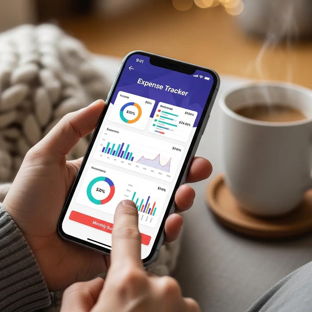
Visual tools turn lists of numbers into patterns you can act on. Charts make trends, proportions, and changes over time obvious—so you can decide quickly what to keep, cut, or adjust.
Most budgeting apps use these visualizations to give clear, actionable insight into your spending and saving habits.
Automatic Expense Tracking & Spending Visualization
An application called the Everyday Expense Tracker System records daily income and expenses and shows monthly views of spending and saving. These visuals help users understand habits and plan next steps.
Automating Financial Management: An Exploration of Automatic Expense Tracking Systems, SKL Naik, 2024
How do pie, bar, and line charts show your spending?
Each chart type highlights different insights:
- Pie Charts: Show how each category compares to your total spending—perfect for a quick snapshot of where money is going.
- Bar Charts: Compare categories or months side by side to reveal shifts in spending habits.
- Line Charts: Track trends over time so you can see rises, dips, and seasonal patterns month to month.
What visualization tools does CalendarBudget offer?
CalendarBudget includes several visual tools to make budgeting easier:
- Expense Breakdown Charts: See spending by category to spot where to trim or reallocate funds.
- Cash Flow Projections: Forecast upcoming income and expenses using past data so you can plan ahead.
- Monthly Budget Reports: Summarize actual spending against your plan to highlight gaps and wins.
How do budget reports improve your financial planning?
Budget reports give a clear account of your finances by comparing what you planned to what actually happened. That comparison lets you correct course, set realistic goals, and make decisions with confidence.
Why compare actuals to your budget?
Checking actual spending against budgeted amounts helps you:
- Identify variances: See where you’re overspending or underspending.
- Adjust budgets: Update categories or limits based on real behavior.
- Set realistic goals: Use past patterns to create achievable targets.
How to create and read monthly budget summaries
Build a useful monthly summary with these steps:
- Gather data: Collect all income and expense records for the month.
- Categorize expenses: Group transactions into meaningful categories for analysis.
- Compare against budget: See where actuals match or diverge from your plan.
- Analyze results: Identify trends and decide which changes to make.
Following these steps yields a monthly snapshot that guides smarter planning.
How can you track debt and savings progress with charts?

Charts make progress visible—and progress keeps you motivated. Visualizing debt payoff and savings goals helps you stay focused and make timely adjustments.
Research shows that visual tools can encourage better financial choices, especially for debt repayment and saving.
Data Visualization for Loan Repayment & Savings
This project examined how visualizing repayment and savings affects behavior. Participants who used visual tools were able to reduce interest costs and save more effectively.
Paying It Back: The Impact of Data Visualization on Loan Repayment Behavior, 2025
Which charts show debt repayment and savings progress?
Use these chart types to track milestones:
- Debt Repayment Charts: Show how balances decrease over time so you can track momentum.
- Savings Goal Charts: Visualize progress toward goals like an emergency fund or a trip.
How does progress tracking help reach milestones?
Regular tracking supports goal achievement by helping you:
- Stay accountable: Keep tabs on commitments and deadlines.
- Celebrate achievements: Mark milestones to reinforce good habits.
- Adjust strategies: Change contributions or timelines based on real progress.
Making progress tracking part of your routine improves the odds of hitting your financial targets.
Using reports and charts is one of the most practical ways to manage money. By understanding patterns, choosing the right visuals, and tracking progress, you can make better decisions and move closer to your goals. CalendarBudget provides tools and reports to help you take control of your finances and reach those milestones.


Leave A Comment