The first round of reports/charts are available in CalendarBudget.
These reports will give you a deeper understanding of your spending habits and help you plan where you can make improvements or celebrate successes.
There are 3 different reports to choose from:
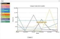
- a line chart showing the last 6 months spending trend for all categories (eliminate categories from the graph by deselecting category checkboxes)
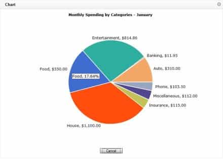
- a pie chart showing the breakdown of the month’s expenses by category

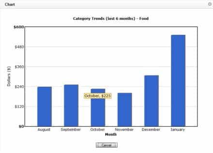
- click on a slice of the pie chart to see the last 6 months spending trend for the category you clicked on

If you don’t have an account already, check out the demo at calendarbudget.com to test out the reports or register for your 1 free month trial to test the reports with your spending habits.

Leave A Comment